# Segmented Area
The Segmented Area Chart offers a blend of line and area chart elements, where specific segments or periods are highlighted with color fills between the data line and the x-axis. These colored segments draw attention to particular events or ranges in the data, making it beneficial for emphasizing changes or anomalies within a continuous dataset.
## The Method To Use
The method is `s.plt.stacked_area()`
It must contain the following input variables:
```python
data: Union[str, DataFrame, List[Dict]]
order: int
x: str
y: str
```
and accepts these parameters as optional:
```python
segments: Optional[list] = None # Explicit segments
x_axis_name: Optional[str] = None
y_axis_name: Optional[str] = None
default_color: Tuple[int, int, int] = (255, 0, 0)
title: Optional[str] = None
rows_size: Optional[int] = None
cols_size: Optional[int] = None
padding: Optional[List[int]] = None
show_values: Optional[List[str]] = None
option_modifications: Optional[Dict] = None
variant: Optional[str] = None
top_area: bool = False # To specify if the area has to be painted on top
threshold: Optional[float] = None # To calculate segments from the value of y
labels: Optional[List[str]] = None # The labels of the segments
```
## Examples
The next examples use this dataset and labels:
```python
noise_data = pd.DataFrame({
'x': range(100),
'y': [
0.62, 0.66, 0.66, 0.63, 0.61, 0.62, 0.61, 0.49, 0.40, 0.46,
0.62, 0.76, 0.72, 0.58, 0.52, 0.62, 0.78, 0.89, 0.84, 0.71,
0.62, 0.58, 0.54, 0.56, 0.60, 0.62, 0.63, 0.63, 0.61, 0.61,
0.62, 0.65, 0.67, 0.66, 0.64, 0.62, 0.63, 0.69, 0.73, 0.70,
0.62, 0.54, 0.50, 0.54, 0.60, 0.62, 0.66, 0.77, 0.84, 0.77,
0.62, 0.49, 0.48, 0.57, 0.66, 0.62, 0.56, 0.55, 0.60, 0.64,
0.62, 0.56, 0.43, 0.37, 0.47, 0.62, 0.78, 0.86, 0.80, 0.68,
0.62, 0.63, 0.68, 0.73, 0.70, 0.62, 0.57, 0.61, 0.70, 0.71,
0.62, 0.54, 0.57, 0.67, 0.71, 0.62, 0.49, 0.37, 0.38, 0.50,
0.62, 0.75, 0.89, 0.91, 0.78, 0.62, 0.46, 0.30, 0.29, 0.45
]
})
labels = [
'A', 'B', 'C', 'D', 'E', 'F', 'G', 'H', 'I', 'J', 'K', 'L', 'M',
'N', 'O', 'P', 'Q', 'R', 'S', 'T', 'U', 'V', 'W', 'X', 'Y', 'Z'
]
```
{% hint style="info" %}
The number of labels doesn't need to be equal to the number of segments of area.
{% endhint %}
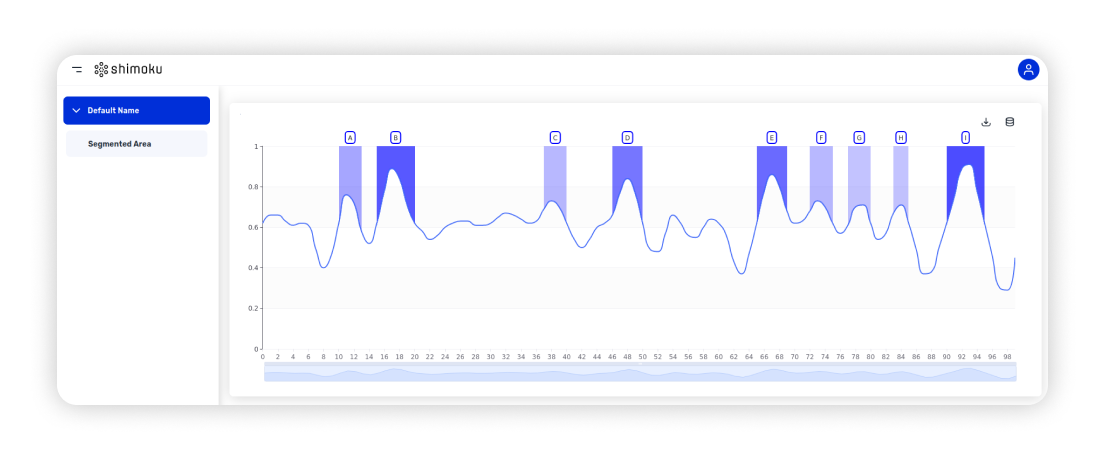
The fist example shows the use of the threshold parameter:
```python
s.plt.segmented_area(
data=noise_data, order=0, x='x', y='y', threshold=0.7, labels=labels
)
```
The second example show the behavior of the parameters `top_area` and `default_color`.
```python
s.plt.segmented_area(
data=noise_data, order=0, x='x', y='y', threshold=0.7,
top_area=True, default_color=(0, 0, 255), labels=labels
)
```
And the final example shows how to define the segments directly, color can be specified in each segment too:
```python
s.plt.segmented_area(
data=noise_data, order=0, x='x', y='y',
segments=[(30, 45), (60, 70, 'var(--chart-C1)'), (75, 95, (1, 220, 1))]
)
```
## Variants
By setting the parameter `variant` to the following values the appearance of the chart can be changed:
{% tabs %}
{% tab title="Clean" %}