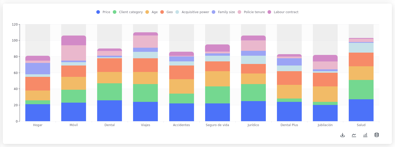
Stacked bar chart with percentages calculated and hidden labels
Stacked bar chart with percentages calculated and hidden labels
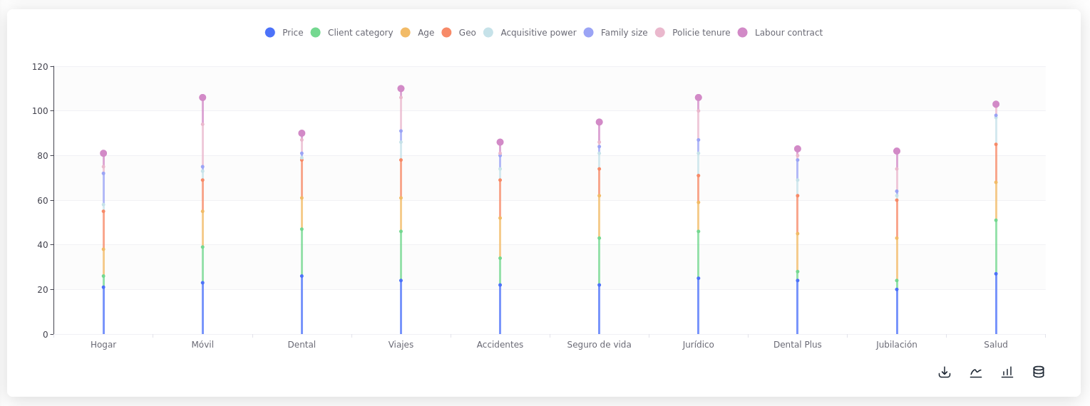
variant='clean'
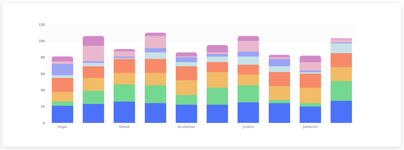
variant='minimal'
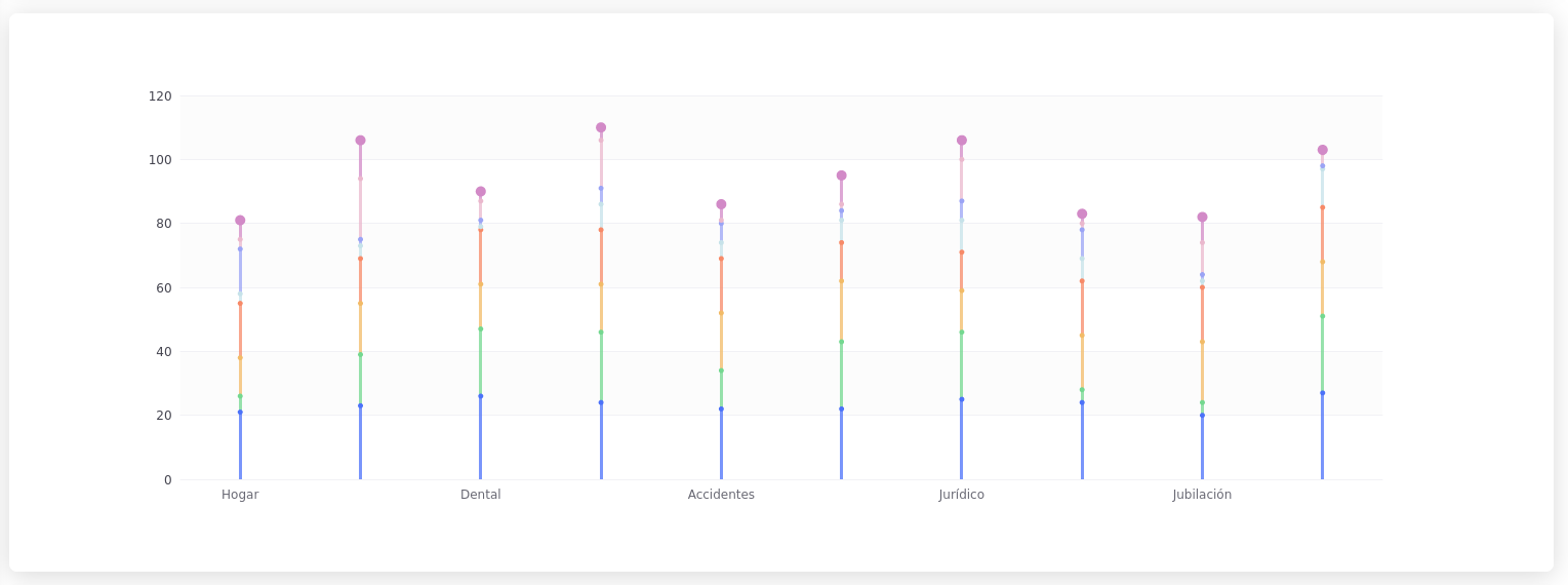
variant="thin"
variant="clean thin"
variant="minimal thin"
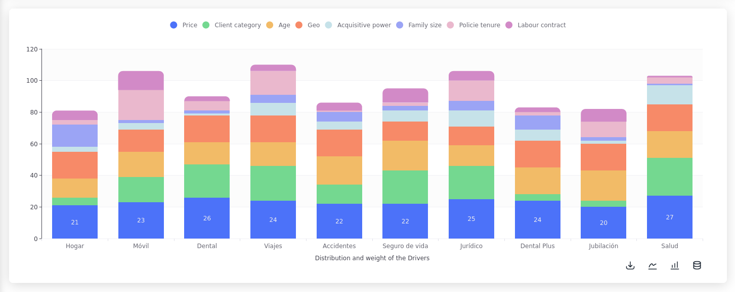
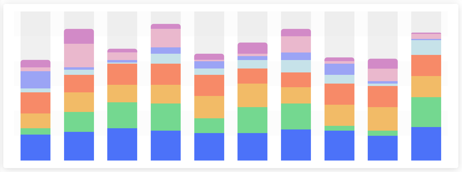
variant="shadow"

variant="clean shadow"
variant="minimal shadow"
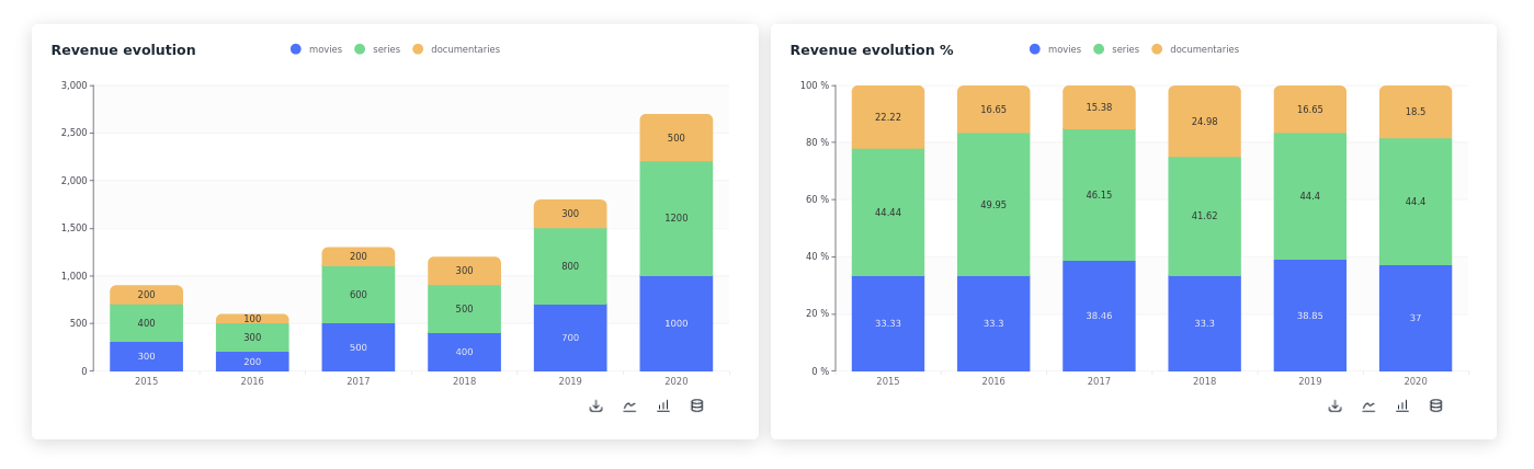
Evolution of revenue by month, total and in percentages
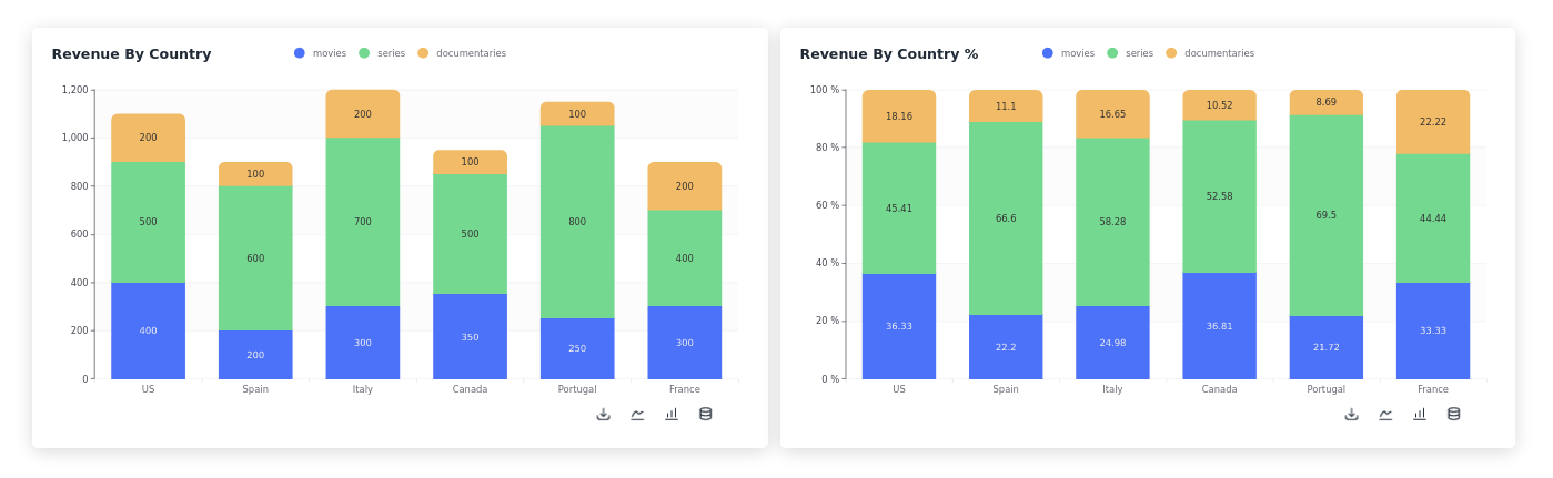
Revenue by country total and percentages