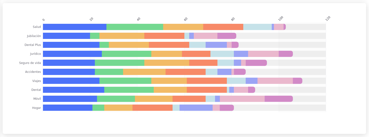
# Stacked Horizontal Bar
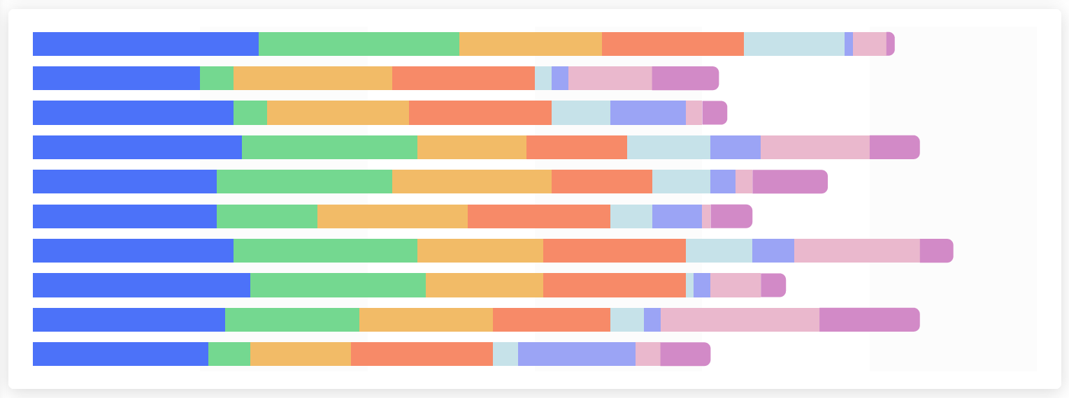
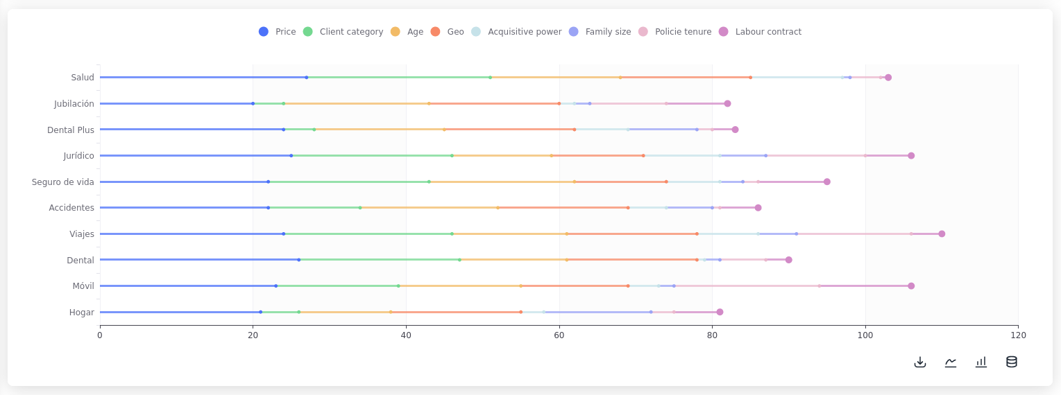
A **stacked horizontal bar chart** shows the composition of each category in a stacked bar, with each segment representing a sub-category. The bars are oriented horizontally so it's useful when there are lot's of labels or when the labels are very lengthy.
Using the same data as the stacked bar example:
```python
s.plt.stacked_horizontal_bar(
data=pd.read_csv('file.csv'), x="Segment", order=0,
x_axis_name='Distribution and weight of the Drivers',
)
```
Horizontal stacked bar
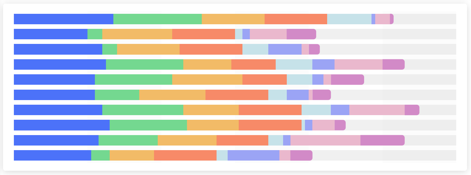
## Variants
By setting the parameter `variant` to the following values the appearance of the chart can be changed:
{% tabs %}
{% tab title="Clean" %}
variant="clean"
{% endtab %}
{% tab title="Minimal" %}
variant="minimal"
{% endtab %}
{% tab title="Thin" %}
variant="thin"
{% endtab %}
{% tab title="Clean Thin" %}
variant="clean thin"
{% endtab %}
{% tab title="Minimal Thin" %}
variant="minimal thin"
{% endtab %}
{% tab title="Shadow" %}
variant="shadow"
{% endtab %}
{% tab title="Clean Shadow" %}
variant="clean shadow"
{% endtab %}
{% tab title="Minimal Shadow" %}
variant="minimal shadow"
{% endtab %}
{% endtabs %}
{% hint style="info" %}
### Featured Content
[changing-the-menu-path](https://docs.shimoku.com/dev/building-web-app/menu/changing-the-menu-path "mention")\
The `menu_path` can be modified.
[using-the-grid](https://docs.shimoku.com/dev/building-web-app/grid/using-the-grid "mention")
It is possible to use any number of rows.
{% endhint %}